Rio's Legacy Website Redesign
UX/UI Design · Branding
Introduction
Designing with a purpose
Client: Rio's Legacy (Not-for-profit organisation)
Role: UX/UI Designer
Duration: 4 months
Team: Project Manager, Developer
Rio’s Legacy is a charity founded in memory of a couple’s son, Rio, who passed away from a life-limiting condition. The organization’s mission is to raise funds to support families in similar situations and build much-needed children’s hospices in Australia. With only three hospices across the country, the charity has a critical role in addressing a substantial gap in care for children with life-limiting conditions.
The goal was to enhance the website experience to better communicate the charity’s impact and ultimately increase donations. I worked closely with a project manager and developer to deliver a user-friendly site that would amplify Rio’s Legacy’s mission.
The Challenge
Creating clarity and connection
The existing website lacked engagement and structure. It didn’t effectively communicate the organisation’s impact, leading to a convoluted user experience. Key pages contained outdated information, and critical features such as donation funnels lacked transparency about how funds were used. This led to confusion and reduced user confidence, resulting in lower donation conversion.
Business challenges included:
Limited Budget: Restricted research capabilities and limited custom development.
Content Disorganisation: The site lacked concise messaging, and essential sections like campaigns and hospice building projects were either missing or poorly structured.
Third-Party Tools: Donation pages and campaigns were hosted on external platforms, adding friction to the user journey.
Understanding the audience
Due to funding constraints, I was unable to conduct new user research. However, I leveraged insights from a previous charity project and best UX practices to guide my design decisions.
Key Persona:
The target audience primarily included families connected to life-limiting conditions and individuals looking to make a meaningful impact. From past research, I learned that donors value:
Empathising through past research
INSIGHT #1
Transparency: Knowing exactly where their money is going.
INSIGHT #2
Emotional Connection: They often have personal ties to the cause and want to see the tangible impact of their donation.
This guided the content structure, emphasising Rio’s story and the charity's impact.
Design process
Structuring for simplicity and impact
Crafting a Clear Path
I began by reorganising the site’s Information Architecture (IA). Key insights:
Users needed clear access to information about Rio’s Legacy, the impact of donations, and opportunities to contribute.
Important sections like "Hospice Building Project" and "Campaigns" were made visible and easy to navigate from the homepage.
Wireframes: Balancing Design and Emotion
Starting with low-fidelity wireframes, I focused on structuring the homepage to maximise storytelling and simplify navigation. I created a content hierarchy that highlighted Rio’s story, the charity's goals, and a clear call-to-action for donations.
Homepage Key Decisions:
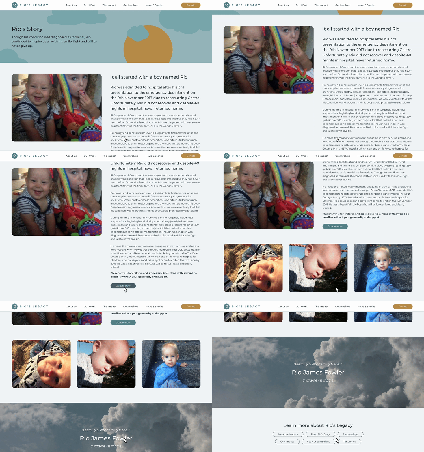
Hero Section: I tested a full banner image layout but realised that the personal story of Rio resonated more. I redesigned it with smaller images and added an illustrative cloud element, symbolising the personal and soft brand tone.
Exit Points: Added multiple clear pathways leading users to donation pages, success stories, and the campaign sections to keep them engaged and informed.
UI Design
The design focused on minimalism to avoid overwhelming users while maintaining a soft, approachable tone. I ensured that even as new content was added, the layout remained consistent and easy to navigate. I created reusable components, such as an impact graph, that could dynamically display the charity’s progress.
Solution highlights
Building trust and transparency
Content Simplification: The homepage was restructured to communicate the charity's mission, including messaging about what had been accomplished with previous donations.
Campaign Integration: The campaigns previously hosted externally on Grassrootz were now visible on the site, making it easier for users to engage without leaving the platform.
Donation Funnel: The donation process was simplified and enhanced by providing clear communication about where the donations would go, GoGive case study coming soon.
SEO-Optimised Blog: I added filtering and tags to the blog to make content more accessible and boost search engine performance.
Interactive Features: A scroll-triggered animation was added to increase user engagement, keeping visitors on the page longer.
Outcome
Site is in the process of getting built. However metrics I would track are:
Increased donation conversion
Improved time on site
Increased user interaction
Feedback from users and stakeholders also reflected the emotional connection fostered through Rio’s story and the redesigned site.
Measurable results and tangible impact
Learnings and Conclusion
Designing with empathy
This project allowed me to combine UX best practices with a deep sense of empathy for a meaningful cause. The challenge of working with personal, limited content pushed me to be more creative in design solutions, ensuring that the client’s story was front and center without compromising the site’s functionality.
Key Takeaways:
Empathy in Design: When working with emotionally driven projects, understanding the personal stories behind the brand can help create a more impactful design.
Third-Party Limitations: Dealing with external tools and plugins requires close coordination with developers to ensure the overall experience isn't hindered.
Next Steps: As the site continues to evolve, I recommend tracking analytics and conducting A/B tests to refine the user experience further.
This project was deeply rewarding, knowing that the design work contributed to a cause that directly impacts families and children in need. I would approach similar projects with an even greater emphasis on integrating user research early on, to further personalise and optimise the design.


