Navigation Redesign
UX/UI Design
Context
Growing complexity needs a user friendly solution
Client: Elegance Tiles
Role: UX/UI Designer
Duration: 2 week sprint
Tools: Figma, FigJam
Elegance Tiles, a leading online tile retailer, approached us with the challenge of adding a new product category—bathware—to their e-commerce platform. This expansion presented an opportunity to rethink and refine their navigation, particularly in the Tiles section, which had grown cluttered and confusing for users.
The existing site navigation was overwhelming for customers due to an excessive number of categories and subcategories, leading to cognitive overload. The new bathware category added further complexity, making it necessary to design a more intuitive and organised navigation system that would enhance the overall user experience.
The Challenge
Streamlining a cluttered and overwhelming navigation
The key challenges identified in the initial analysis included:
Cognitive Overload: Users faced too many options under the "Colour" section, with individual listings for every shade rather than groupings by tone (e.g., light, medium, dark). This caused decision fatigue and slowed down the browsing process.
Confusing Labels in "Rooms": Categories like "Floors" and "Walls Only" were misaligned with user expectations, as these labels described applications rather than room types, causing confusion.
Poor Global Navigation Visibility: The global navigation was easily overlooked due to its low contrast and small font size, which hurt the discoverability of key items like "Offers."
Inconsistent Product Representation: The shapes available in the product listings were not consistently reflected in the navigation, further complicating the user journey.
My approach
User-Centric Navigation Structure
I prioritised simplifying the navigation to reduce cognitive overload and align with user expectations. The goal was to allow users to explore visually, quickly find relevant products, and minimise decision fatigue.
Competitive Research
I conducted a competitive analysis to understand how other e-commerce platforms managed product variety. This informed my decision to reorganise products by broader categories (like tone-based colour groups and size-based shapes) rather than overwhelming users with an excess of specific choices.
Testing Navigation Concepts
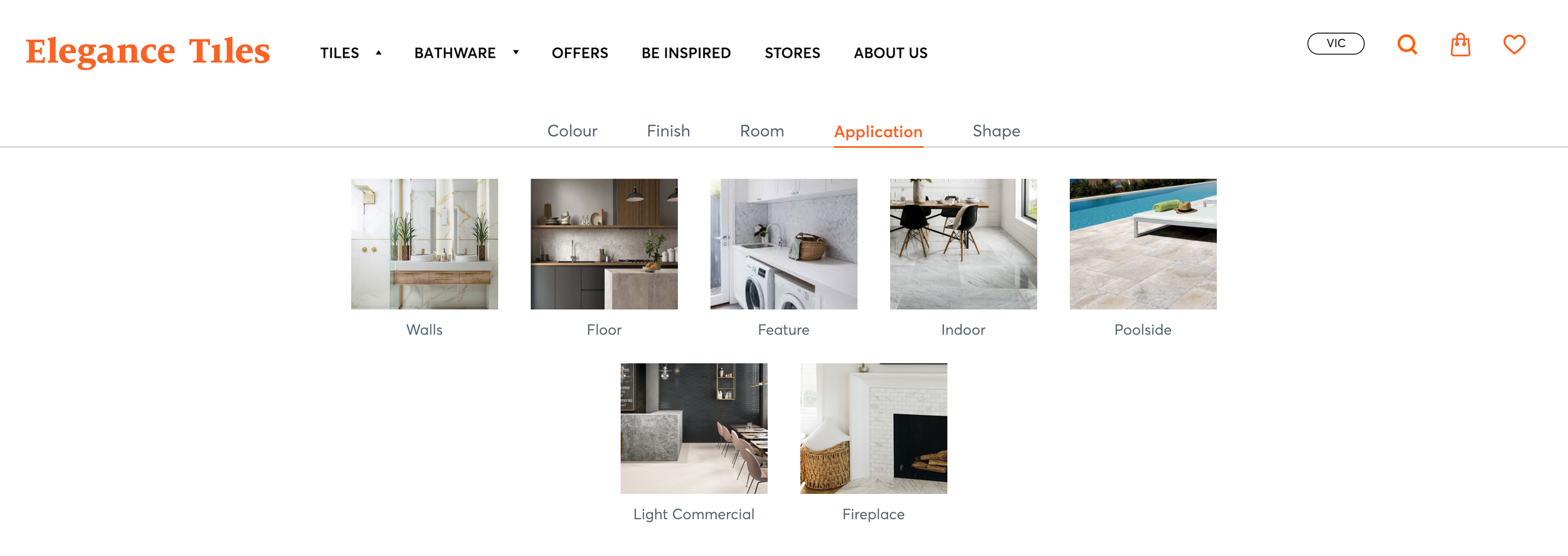
I considered both horizontal and vertical layouts for the navigation. After testing, I opted for a horizontal secondary navigation bar, which allowed users to browse more intuitively by colour and style, while utilising the full container width. This minimised scrolling and made the browsing experience more streamlined.
Simplifying the user journey
New Categories for Clarity
"Application" Category: To resolve the confusion around "Floors" and "Walls Only," I introduced an "Application" category, clearly differentiating room types from the intended use (e.g., kitchen vs. bathroom).
Shape and Size: Instead of confusing users with overly specific shape options, I introduced broader size categories that could be validated through a user survey. This new structure would better align with user browsing habits and improve product discoverability.
Enhanced Visual Hierarchy
To improve global navigation visibility, I increased the size and contrast of key categories like "Offers" and used background changes (from transparent to solid white) to draw attention when users engaged with the navigation. This improved readability and focus without overwhelming the page visually.
Outcome
The redesigned navigation addressed several key pain points:
Simplified User Journey: The introduction of secondary navigation organized by broader categories (like color tones, applications, and sizes) made it easier for users to filter products without being overwhelmed by overly specific options.
Improved Content Visibility: The global navigation was enhanced, making high-priority categories like "Offers" more visible and easier to find. This is expected to improve user engagement and conversion rates, especially for users looking for discounts and promotions.
Clearer Product Categorization: The addition of the "Application" and "Shape" categories improved the accuracy of product listings and streamlined the browsing experience, aligning user expectations with what they see in the product listings.
Responsive Design: The horizontal navigation layout was optimized for both desktop and mobile, ensuring that users had a consistent, intuitive experience regardless of their device.
Simplified navigation for a better user experience
Next steps
The redesigned navigation system is currently in the process of being built and implemented by the client’s development team. After launch, I recommend running user surveys and A/B testing to validate assumptions, such as whether categorising tiles by size improves user satisfaction and decision-making. Post-launch analytics will provide further insights into the effectiveness of the new design in reducing cognitive overload and enhancing product discoverability.
Validate, optimise, and measure success
Reflection
This project reinforced the importance of creating user-centered navigation that balances the complexity of a wide product range with simplicity and ease of use. By streamlining the navigation and improving visual hierarchy, we’ve laid the groundwork for a better user experience that supports both browsing and purchasing decisions.
The next challenge will be to assess how these design changes impact user engagement and conversion rates once implemented and whether further optimisations will be necessary.
Designing for growth and usability


